Your Home: Best Design Trends for Autumn
Posted on October 12, 2018 by Laura LuckyRich tones, color blocks, a touch of black and big flouncy florals are what’s to come this autumn and winter. Below we show you how to create these exciting trends in your home this coming season.
 OVERSIZED FLORALS
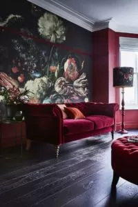
This is a really lovely trend – who doesn’t love flower prints and on a large scale? Look out for big blousy designs that have a pre-Raphaelite style and you’ll find them on cushions, bedding and as murals (shown here). Keep the rest of the look simple, so the florals become the star and pick out key colors to accessorize with.
MODERN NEUTRALS
This is a combination of different elements that creates a beautiful and simple look with the emphasis on natural-looking furniture. As Kate Butler, head of design at Habitat, explains: “There’s been a focus on stripped timbers, wood grain and a return to simple, natural patinas and materials within furniture.” Team this with gently patterned crockery, soft grey chairs and a neutral block-colored textured rug to complete this calming trend.
ALL THE PINKS
Dusty, old-fashioned pinks are all the rage for autumn which is a perfect antidote to the usual rusty tones we see, and as it’s such an easy-on-the-eye color it’s simple to apply to our homes. We asked Karen Thomas, head of design at Home at Marks & Spencer to explain this trend: “Adding warmth and color to your home, these tones will work especially well alongside metallic, contemporary greys and the new wave of darker neutrals. If you’re feeling bold, go for statement upholstery in vibrant pink velvet or for a more understated look try painterly florals and layer textures and fabrics to add interest.”
BRIGHT SHAPES
Playful and full of color, this trend is certainly a happy one. Look out for bold shades in different shapes – stripes, geometrical, spots and blocks and you can’t go wrong. Pop it all together and you’ll have this trend spot-on. Lois Vincent, home designer at House of Fraser, says: “Its design DNA lies in its mix-and-match of graphic geos, bold colors and clean lines. Running through it all is a confidence to clash, not match. The only rule? Make it modern.”


